CHAIS D'ŒUVRE
CHAIS D'ŒUVRE
Crafting a premium wine club experience worthy of France’s best Sommelier
Crafting a premium wine club experience worthy of France’s best Sommelier
Crafting a premium wine club experience worthy of France’s best Sommelier
Live website
Role
UX/UI Designer
UX/UI Designer
duration
4 months
4 months
team
Coralie Castot Art Direction
Arthur Guillaume Product Manager
My contribution
Usability Testing
Heatmap Analysis
Prototyping
Motion Design


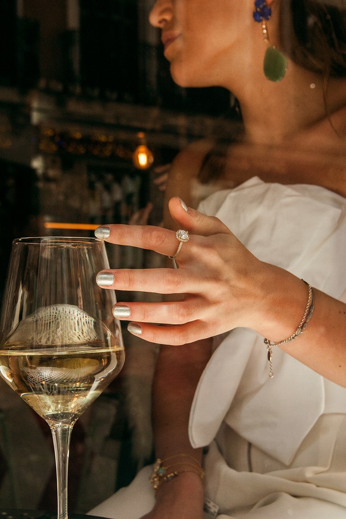
Chais d'œuvre is a high-end e-commerce platform created by Manuel Peyrondet, France's best Sommelier. The challenge: translate the expertise of an exceptional sommelier into a digital experience that feels as refined as the wines he selects.
Chais d'œuvre is a high-end e-commerce platform created by Manuel Peyrondet, France's best Sommelier. The challenge: translate the expertise of an exceptional sommelier into a digital experience that feels as refined as the wines he selects.
The problem
Auditing the existing purchase funnel through usability testing and heatmap analytics revealed a core tension: the same browsing experience was serving two very different users. Seasoned buyers wanted advanced filters, by grape variety, appellation, vintage. Novice buyers got lost in that vocabulary and dropped off before converting.
Auditing the existing purchase funnel through usability testing and heatmap analytics revealed a core tension: the same browsing experience was serving two very different users. Seasoned buyers wanted advanced filters, by grape variety, appellation, vintage. Novice buyers got lost in that vocabulary and dropped off before converting.
The Solution
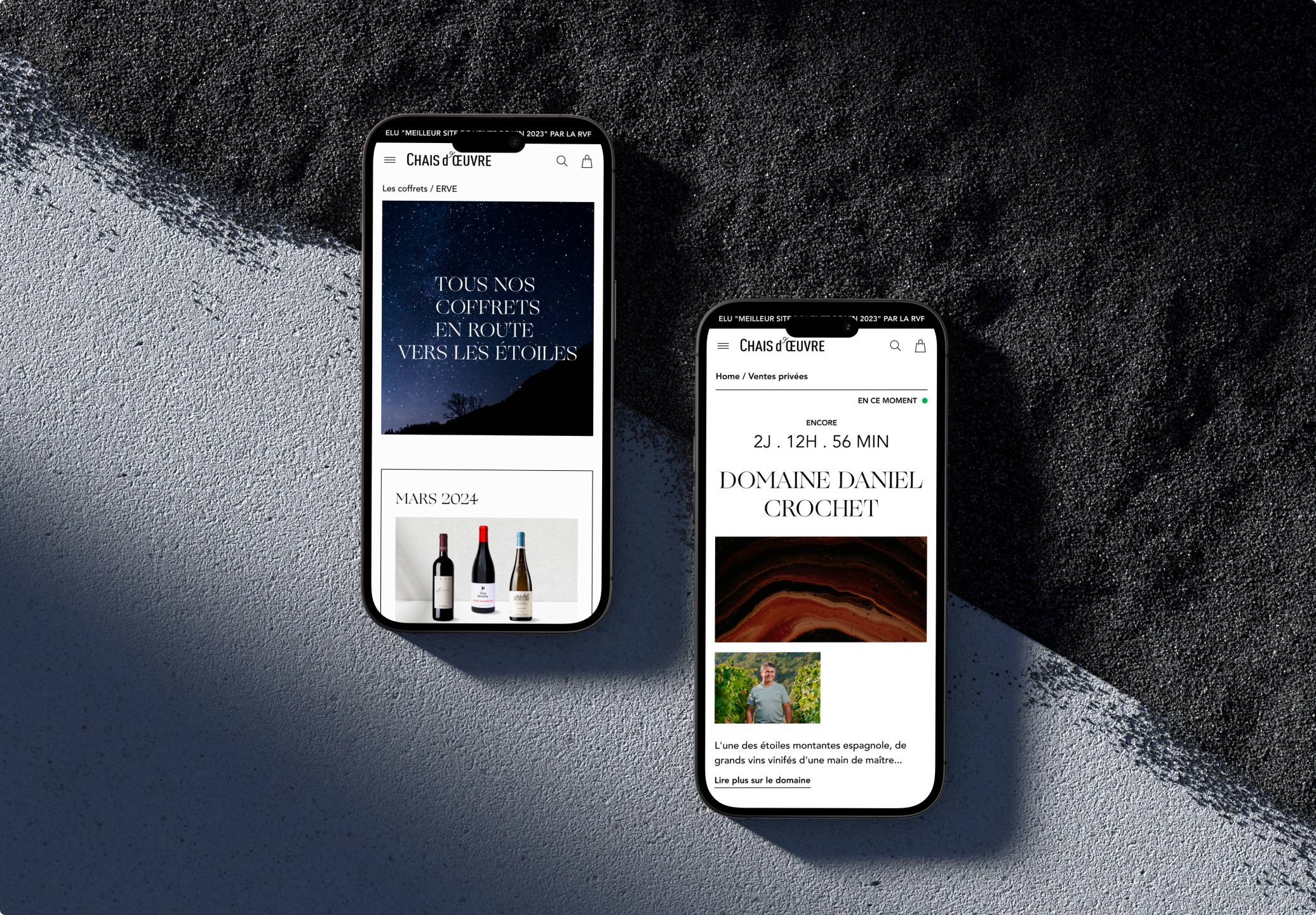
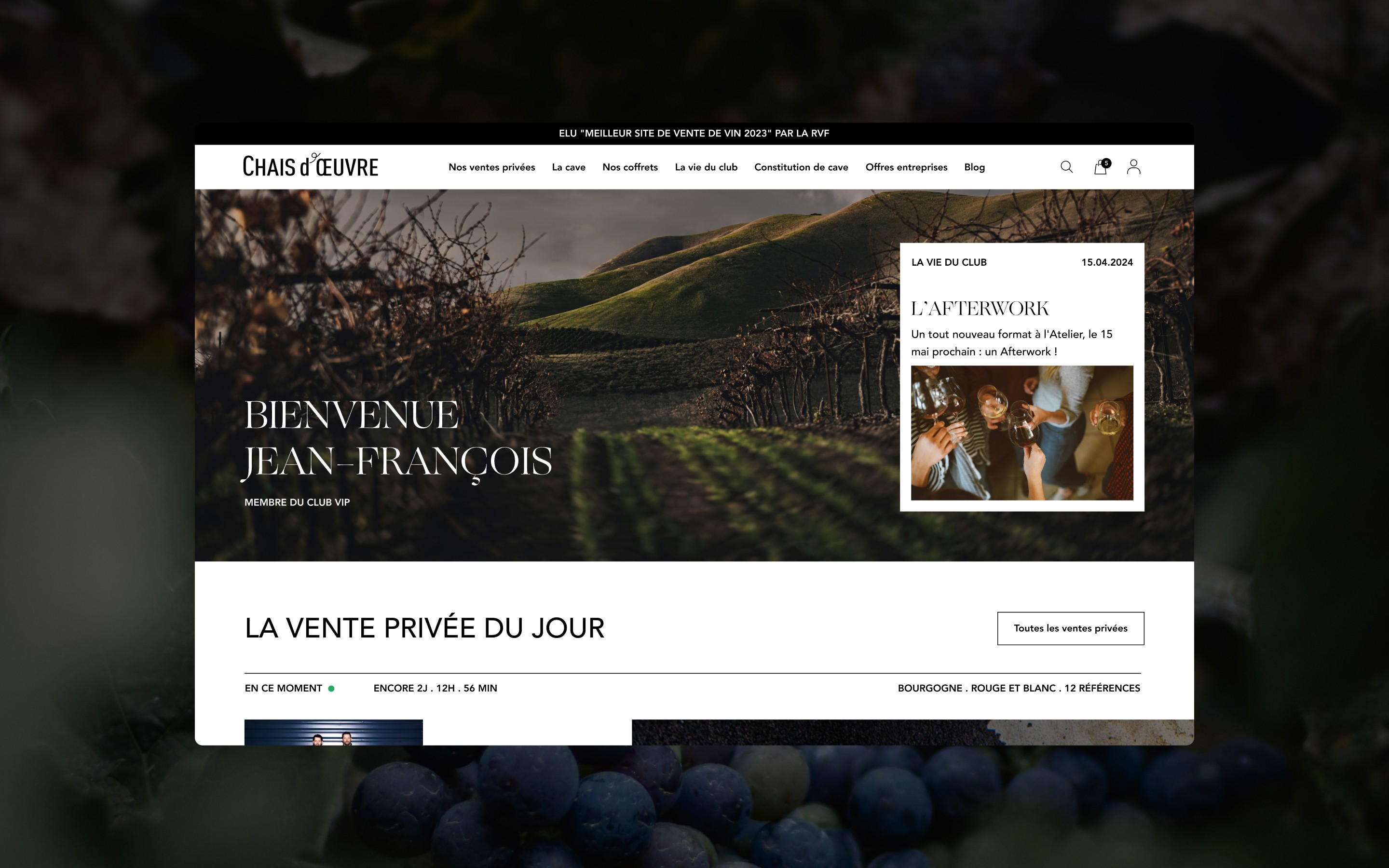
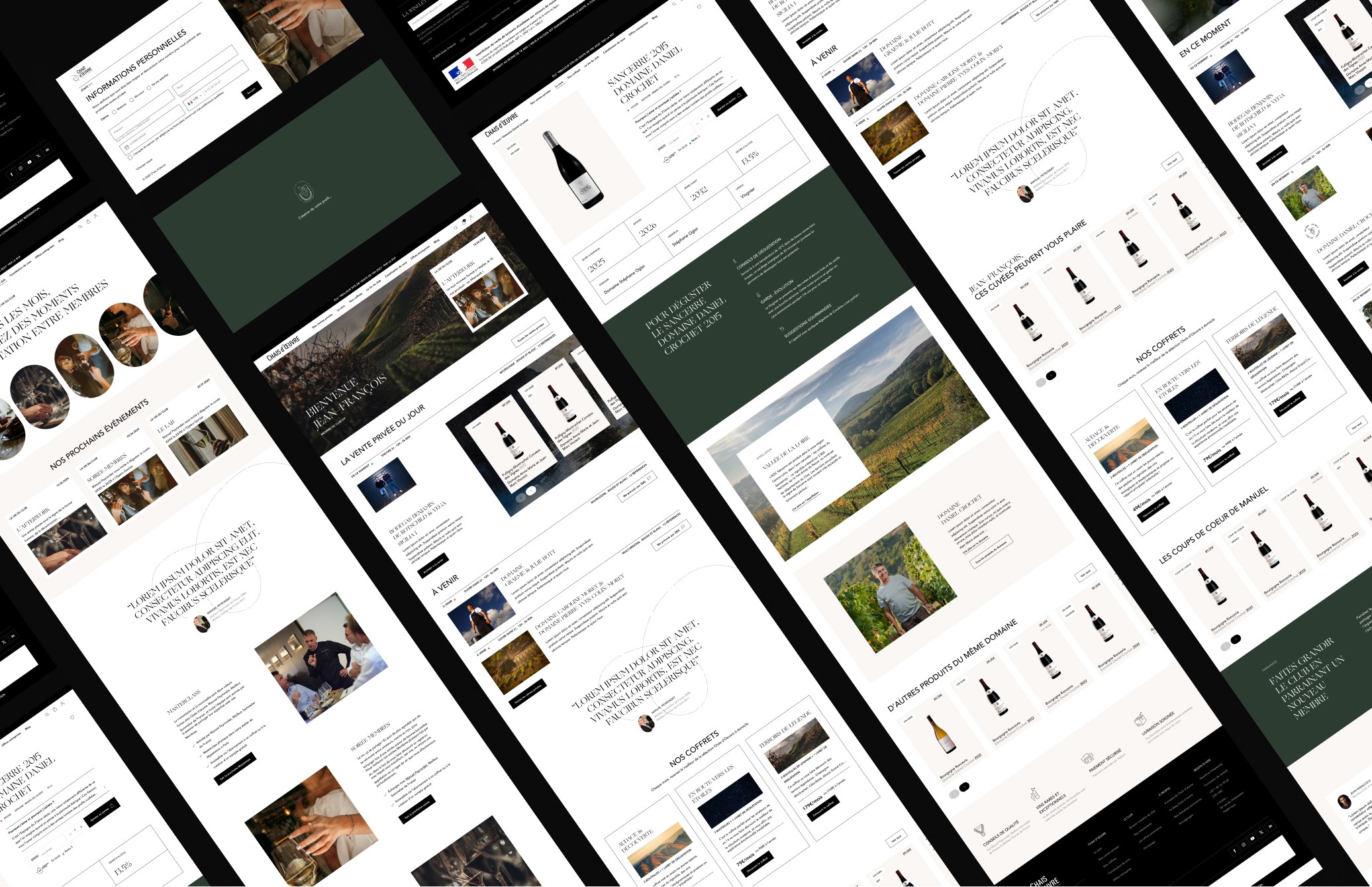
I restructured the funnel around two distinct entry points. A guided mode with simplified recommendations for those just discovering wine, and a direct access to expert filters for connoisseurs. The goal was to reduce friction at the top of the funnel without stripping the experience of its depth.
I restructured the funnel around two distinct entry points. A guided mode with simplified recommendations for those just discovering wine, and a direct access to expert filters for connoisseurs. The goal was to reduce friction at the top of the funnel without stripping the experience of its depth.
The craft
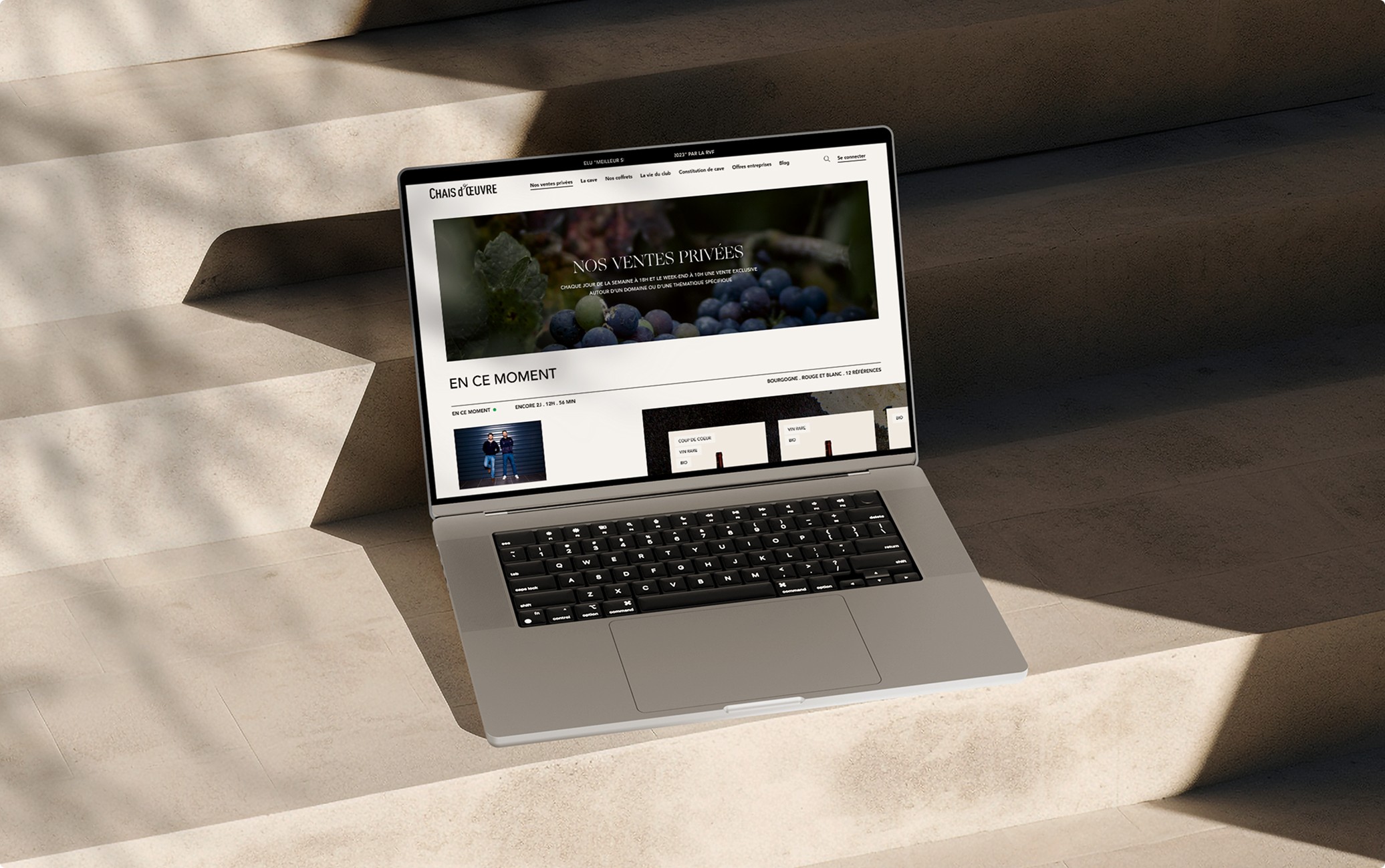
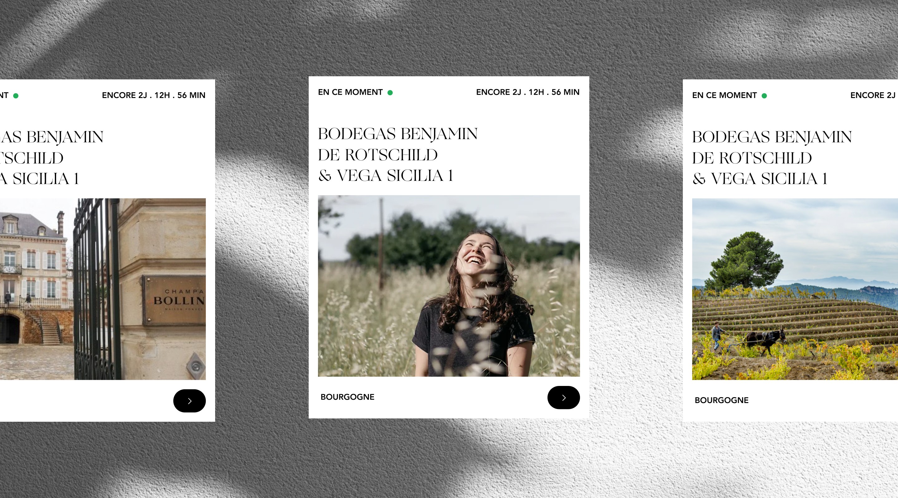
Beyond the UX, the visual direction needed to carry the weight of the brand. We translated the sensory experience of wine into texture, using materials evoking wood, glass, and nature to add tactile depth to the interface. Every element, from typography to motion, was designed to feel as considered as the sommelier's own selections.
Beyond the UX, the visual direction needed to carry the weight of the brand. We translated the sensory experience of wine into texture, using materials evoking wood, glass, and nature to add tactile depth to the interface. Every element, from typography to motion, was designed to feel as considered as the sommelier's own selections.
The result is an experience that works for both the curious newcomer and the expert collector, on desktop and mobile, without compromising on luxury.
The result is an experience that works for both the curious newcomer and the expert collector, on desktop and mobile, without compromising on luxury.
Take a look at another one of my projects.
Take a look at another
one of my projects.